Hey friends,
As it has been miserably cold here in Blacksburg since the new year started I have unfortunately made no progress yet on my goal to walk all the streets. However, I do have some other goals on my list for 2018 that I have yet to share here on the blog. For example, I would like to complete a Lynda CSS course before the year ends. I would like to attempt to screenprint with the kit my husband gave me for my birthday last year (preferably without making a complete mess of my apartment…). I would like to knit something following a pattern (that isn’t a scarf, pillow, or standard headband). But as this post title suggests, the big one for the day is my goal to write, illustrate, and publish a children’s book. I am really excited about this one and have already been working for a couple months on ideas, sketches, research, layouts, etc. There will definitely be lots more to come in future posts about the process, the origin of the idea, the inspiration, and my emotions related to it all, but for now I wanted to share a little research project I have been working on in order to learn more about the world of children’s books.
So in college I majored in architecture. This obviously meant I took lots of design courses and in design courses one learns the importance of diagrams. There is beauty to the distillation of an idea down to it’s core parts/nodes/interactions/relationships. In college I also took a children’s literature course (which I LOVED). The remainder of this post will be a combination of those two areas of my past experience as I explore popular children’s book covers (primarily the ones listed here).
As I have been working on the artwork for this book it has become increasingly obvious that having a good cover is vital. But what constitutes a good cover? Why are certain ones more successful than others? And let’s be honest here. As much as we would all like to say that we try not to judge books by their covers, we know we all do it. We’re visual creatures with a ton of sensory input to sift through every day and the world is FILLED with books and art and illustrations. It would be impossible to not function this way. But knowing that, how can one little book ever hope to stand out admist all the others?
(and before I get discouraged and anxious and fall into an existential crisis, let’s get going…)

Book Cover Analysis
Aberdeen
by Stacey Previn

- mouse the main subject
- eye drawn to the red balloon
- colorful flowers
- eye moves upward to top right
- subtitle: can a little mouse have a big adventure?
The Bear and the Piano
by David Litchfield

- magical environment with fireflies and vines
- central layout
- curtains suggest a performance and help frame the subject
- why is there a piano in the woods? is it big or is the bear small? what will the bear do with it?
Book Uncle and Me
by Uma Krishnaswami, Illustrated by Julianna Swaney

- she’s looking off to the left (what’s over there?)
- the birds flying add motion
- sign that says “Vote Samuel” (do we meet samuel?)
- the question we’re all asking…what’s a book uncle?
- colorful stack of books (inviting and fun)
- obviously about reading; she is holding a book, stack of books, sign says “books free give one take one read read read”
Cat in the Hat
by Dr. Seuss

- A classic book with a well-known cover
- based upon thirds
- blue, black, white, and red
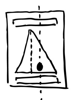
Cogheart
by Peter Bunzl

- title stands out well amidst so much going on
- dashed line for movement (blimp)
- the fox, people, and blimp are all moving in a counterclockwise direction
- subtitle: a stunning adventure of danger and daring
- windup fox, moon/stars/clouds, clock, 2 people, buildings, key, locket-like photo
- suggestive of travel, especially traveling in time
Counting Thyme
by Melanie Conklin

- cold blue background with most warmth form the window with the girl in red
- papers thrown/flying
- Thyme spelled like spice…maybe a name?
- bird in a window…why?
- just in general, a question of what is going on? what is this about? I am intrigued.
Dave’s Cave
by Frann Preston-Gannon

- distressed, masculine font
- warm colored focal point (caveman)
- he’s looking off at… what? his cave?
- simple, but asks a question of what is special about dave’s cave? he’s smiling… is he proud of his cave?
Full of Beans
by Jennifer L. Holm

- has a stamped/lithograph/letterpress quality
- solid colors
- movement off page
- just the hand of a kid within the visible frame (leaves mystery)
- dog in a wagon filled with cans (of beans?)… where are they going?
- subtitle: Never tell a lie…Unless you have to.
- what might you have to tell a lie about? mischievous. sounds like like adventure/trouble/mishap
Goodnight Moon
by Margaret Wise Brown, illustrated by Clement Hurd

- classic book
- solid colors
- layout based upon diagonal eye movement between the red-orange of the fire, to the red-orange of the curtains, to the moon in the window
Henry and the Guardians of the Lost
by Jenny Nimmo

- red focal point (jacket on boy, assumed to be Henry) with cool colored surroundings
- is that a mini person by him?
- markings on the archway suggest historical/ancient/mystical
- wolves hidden in the woods on the sides (danger lurks)
- he’s looking upward, presumably at the markings
- is Lost a group? a place? anyone lost in that forest? does Henry meet the guardians because he gets lost? does he become a guardian?
Journey
by Aaron Becker

- the red of the boat and crayon match; similar to title
- from focal point of boat in lower left, follow gaze of girl up to the castle where presumably her journey will take her; movement
- upon closer inspection a light purple bird in the sky above the towers that seems out of place compared to the colors of the castle, but more similar to the brightness of the boat
Leave Me Alone
by Vera Brosgol

- yelled title is the focal point
- secondarily the old lady yelling it
- and then eyes go to the four individuals who look friendly and interested in the lady (and are probably the reason for her exclamation…)
Little Red and the Very Hungry Lion
by Alex T. Smith

- colorful
- expressive characters: mean looking lion, girl looks disapproving/quizzical
- set of three: lion, girl, goat
- eyes looking up at lion, lion looking at reader
- is the lion going to try and eat the girl? neither her nor the goat look too concerned about that possibility…
Madeline
by Ludwig Bemelmans
- classic book and cover
- eiffel tower and miss clavel are aligned but slightly off center
- the real focus is not France, nor the eleven girls, but Madeline in particular who is turned around to face the reader and is along the central axis of the page
The Night Gardener
by Terry Fan and Eric Fan

- assumption that the night gardener of the title made this owl tree
- how is the boy related to the story? is he the gardener? discoverer?
- it is, indeed, nighttime
- stable and centered, cool colored; nonthreatening cover
One Day in the Eucalyptus Tree, Eucalyptus Tree
by Daniel Bernstrom, Illustrated by Brendan Wenzel

- colorful jungle-like scene
- animals looking down from vines/tree
- boy looking at pinwheel in hand
- he’s in motion, walking and looking happy
- assumed to be aimed at younger readers given the repetition in the title
Pax
by Sara Pennypacker, Illustrated by Jon Klassen

- dog/fox/wold looking out over the land toward the sun; assumption that it’s name is Pax?
- is it longing for an adventure? looking for something? enjoying the sunset? wild? tame? lost?
- this one is pretty vague as to potential plot
Penguin Problems
by Jory John and Lane Smith

- assumption: the problem has to do with too many penguins
- repetition and pattern (and breaking it)
- simple and effective color scheme
- one different hidden among many of the same
- is he confused? concerned? annoyed?
- could be a counting book…
Saving Wonder
by Mary Knight
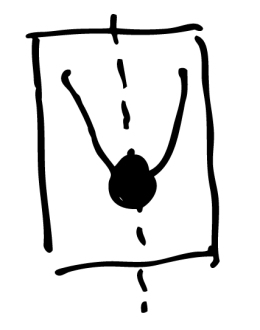
- deer is the focal point, with antlers become trees that two children (silhouettes) are sitting in
- Wonder the deer’s name?
- wonder at nature? (mountains, clouds, branches with leaves)
- perhaps a pun suggesting that both nature and the feelings of wonder toward nature are in need of saving?
Some Kind of Happiness
by Claire Legrand

- looks like a golden section/rectangle ratio might have been used for the layout
- central axis with multiple points of interest along it including a house, person, and crown
- I first assumed the person was looking up the hill at the house, but perhaps walking down in the woods toward the crown?
- where is the happiness found? multiple kinds of happiness?
- yellow of the crown draws eyes downward; seemingly hidden in the forest
The Storyteller
by Evan Turk

- off-center
- the stories extend beyond the border, as do the clouds (storytelling of a world beyond the current borders?)
- big and exciting and magical
- illustration reinforcing the title
- what’s in the bag? what does he tell stories about? to whom?
Tree
by Britta Teckentrup

- subtitle: a peek through picture book
- owl’s hold like a peek through hole into a home/different world; let’s look inside
- colorful, cool background with warm colored trunk and animals
- simple shapes and generally inviting
We Are Giants
by Amber Lee Dodd

- title in red and giant
- red echoed in the flowers
- shadows/silhouettes are secondary focal point
- shadows bigger than the people/kids really are; perhaps they feel big and powerful? holding hands with friends… the power of friendship? are they playing pretend?
When Friendship Followed Me Home
by Paul Griffin

- pun on a dog named Friendship or the dog becomes a friend
- title shaped to fit the dog shape and is the primary focus
- mostly shades of blue with yellow accents
When the Sea Turned to Silver
by Grace Lin

- double symmetry broken by the sea/horse/people
- downward slope and fear of children and anger of horse create an overall scary scene
- disruption of peace and order
- intertwined cool and warm colors, though dominated by the blue of the sea; interrupted by the silver of the horse
- seemingly Asian symbols on top and bottom
Wolf Hollow
by Lauren Wolk

- writing in a journal (in a place called Wolf Hollow?)
- the title is in a hollow created by the trees/words
- perhaps an actual cozy, secret place, or safety is found in the process of journaling?
- description within the script that acts both as a frame and a conveyor of information
Wow. Okay. So, I think I am done with that exercise for a while. That took longer than I expected!
In conclusion, I think there are a ton of excellent cover examples that use all sorts of methods for conveying the subjects of their stories and arousing interest in the reader. Overall the basic concepts I seemed to pick up on include:
- Warm and cool colors of the illustrations
- Movement and stability in the layouts
- Symbolism, metaphors, puns
- Typeface, font size, and color
- The direction of the gazes of the characters
- How to create focal points and move the readers gaze
- How to invoke questions and interest
So, any thoughts? Insights?
Stay posted for more information about my 2018 goals, specifically the upcoming children’s book!

[…] 2018 Goals 2018 in Review 2019 Resolutions […]
LikeLike